POTENTIAL FONT RESEARCH 2
Now that my design for my logo had been changed and refined, I felt the need to look for some new fonts to match and compliment my new design. I still wanted the fonts to seem somewhat halloween-ey, however I felt that overall a cartoony font worked better, while still giving off a halloween vibe.

|
This was one of the first fonts I chose to look at, since in the past I had used more cartoony fonts I thought it would be a good idea to have a look at some fonts specifically halloween themed. This was really the only one that stood out to me as a font that could work specifically with my logo. I felt that the use of pumpkins was very similar if not the same to my original designs for my logo, and so as the main colour scheme for my logo was now green and orange, I felt this could further emphasize the halloween theme.
|

|
This font was also one that I thought could further emphasize the halloween theme. I liked that it was a little un-hinged and spikey looking, perfect for a logo inspired by the devil himself. It also reminded me of wood, which made sense as halloween myth features wood or trees in some way. I also felt that this would also be quite legible even if typed along a path or around a curved object, such as my logo.
|

|
Now this is an interesting font isn't it? It's cartoony, but also feels kind of halloweeny because of the placement and curvature of the letterforms. This is kind of a "Monster of the Swamp" themed font, although as it was in the cartoony section, this was probably not intentional. I felt that this font could add a really fun and quirky feel to my logo, my only concern being it's legibility if it was typed on a curved path, or tilted in any way.
|

|
This is where I started looking more at cartoony fonts as opposed to halloweeny fonts, I have always associated these kind of fonts with halloween as they are popularly used on packaging for halloween themed candy. Thick, wonky and playful letterforms dominate most halloween candy packaging and halloween decorations, so it makes sense to use such fonts in my corporate package. I liked this font because it's legible but also maintains a fun, quirky feel to it. It's the slight differences in placement and tilt that give it it's character, and the curvature of it's letterforms that give it a playful feel.
|

|
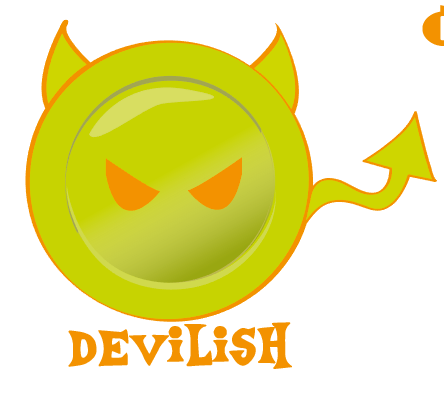
I chose this font because it has a fun, young and stylized feel to it, it has minor differences in size throughout the font but still remains legible. I really liked the quirky shape of the dots above the "I"'s within this font. I really felt that this font communicated the michevious-ness of the word "Devilish", through it's little quirks and gave of a playful feel as opposed to being scary or creepy.
|

|
I chose this font because it has a really quikry and odd flow to it, which I think makes it perfect for a halloween themed logo, it has a lot of personality and definitely stands out, I also feel that it is intriguing and draws the eye to it somehow. It's almost a fantasy based font in some ways.
|

|

|

|

|

|

|

|
|

|
