Double Page Spread Designs
The first thing I had to do to create my double page spread was create some design sketches and digital mock-ups of these sketches. I started by looking online for magazine double-page-spread layouts, to see if any grabbed my attention, and to look for design inspiration. I figured while looking at fashion spreads, that they are a lot more visual and less about the text, so I decided to focus more on making the layout visually impressive than legible or article based. This meant that I had a lot more leeway with which I could be creative, but because of this my designs were more difficult to produce and work with. Here are the sketches I created below:
Sketch 1

This layout design was inspired by wide kerning, I wanted the header to be spread across the two pages, like you'd sometimes see in a book. I thought that this would be a good way to make it stand-out and visually stimulating without making it too-busy or messy. I wanted the emphasis to be on the header and the images instead of the body text.
sketch 2

This layout is inspired by geometric text organisation, I wanted the header to be split into three sections, one that's tilted, and two that are vertical in different sizes beside it. The lead-in would be on the next page, and the emphasis would be on the header and images instead of the body text.
Sketch 3

This layout is inspired by gossip magazine layouts, I wanted it to be visually stimulating but organised, even though I was taking inspiration from gossip magazine layouts, I didn't want it to be as busy as most gossip magazines. There is barely any space for body text in this layout, because the emphasis was supposed to be on the header and images like the other sketches/layouts.
sketch 4
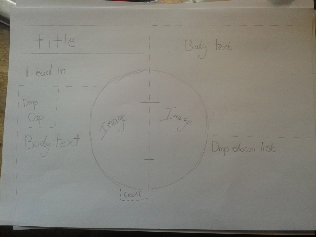
This is the final layout I created, this was inspired by a make-up spread layout I saw online, which should how to apply a certain make-up look. The images were contained within a circle, and I really liked how creative the layout was, so I decided to base this layout on it. The emphasis would be on the images and header instead of the body text.
Digitally Re-created Sketches
This was the first design I re-created, this is also the first sketch I made. This layout was actually inspired by a preference of text organization and letter spacing, the idea was to have the header spread across the two pages, like you'd sometimes find in a book. It was mainly inspired by wide kerning, which I thought would be a simple and visually appealing way to make a header stand out, and be eye-catching from a distance. Since my typography was fur inspired, and because it already has some impact to it, I didn't want the layouts to be too-complex, but I did want them to be very visual, as fashion magazine spreads are.
No. 1
This is a much more visual and complex design, I inspired by visual and geometric layouts on this one. I wanted the header to be separated into three sections, one where the text is slanted, and two other sections where the text is on a baseline and very legible. The text is at the side next to the header, with images below, this way the layout is much more creatively and visually inclined because the images are more prominent in the layout hierarchy.
No. 2
This is my third layout design, this is actually inspired by a fashion spread (make-up spread actually) that I saw online. I really liked how the images were placed within the circle, this was very creative in my opinion, and also visually appealing to me. This would also be a lot more visual than some of the other designs, as soon as I made a digital version of this design I realized that with the software I'd be using (Adobe InDesign) it would be quite difficult to wrap the text around the circle, and actually fit images into it and make it look professional, however I decided that along with the first layout I would be making mock-ups of these. I wanted to make a mock-up on this layout because I thought it'd be a challenge and would really be educational for me when it comes to learning how to use Adobe InDesign.
No. 3
This is the last digital design, I wanted this to visually appealing but also very organised, I took inspiration from gossip magazines for this layout. The wanted the header to be quite interesting and to draw the eye. Unlike the other layouts this design includes a pull quote. I thought I'd add a pull quote because this mimics gossip magazines, as they regularly use pull quotes in these type of magazines.
No. 4
This is the last digital design, I wanted this to visually appealing but also very organised, I took inspiration from gossip magazines for this layout. The wanted the header to be quite interesting and to draw the eye. Unlike the other layouts this design includes a pull quote. I thought I'd add a pull quote because this mimics gossip magazines, as they regularly use pull quotes in these type of magazines.
Image Choices
Before I even began creating the mock-ups I had to gather all the necessary ingredients, so, I went online and looked for some images that I wanted to use for the page spreads. I was drawn towards high-fashion photographs, because I was going for a Vogue magazine feel, and Vogue magazine only ever uses high-quality images, Vogue magazine is also geared toward much more artistic and high-fashion photo shoots. All the images had to contain fur, because the typography is based on fur, so it only makes logical sense that the images would reflect that, as a real magazine article makes sure that all its layout elements relate to an overall theme or celebrity. Here are the images I chose:
I chose most of these images more because of the quality than because I liked the actual images themselves. I either wanted the photos to be very edgy and high-fashion or of a model on the catwalk. I had some issues with the images I picked as some of the layouts actually called for horizontal images instead. I also had to resize and crop some images as to make them "work" with the layouts I had created.
