Task Sheets
Elements Of LINE
The first task sheet focused on the elements of line, I had to demonstrate types of lines on the sheet, and also find two existing pieces of artwork that demonstrated the element on the sheet, the two things I enjoyed most were finding and researching the pieces and artists I chose, and desiging my own piece of work. Even though I had a lot of fun producing my piece, it didn't really convey the feeling I wanted, and because the picture was taken on my phone with flash, the photograph I took of it was quite dark, whihc made it hard to see the piece, the piece is supposed to convey the feeling of rain, as it falls and creates small torrents in the water, the idea was great, but the execution was really lacking in my opinion. It also doesn't help that the photograph is unusually dark either. I had a little bit of trouble finding artwork to use as secondary resources, as the only artist research I had done on my previous course focused a lot more on artists within a specific art movement, instead of standalone artists that demonstrate a certain element of art, however, it was very easy to find famous artists by searching online, this was made even easier as line art is one of the most commonly used elements in art.

Elements of Shape
The second task sheet focused on the element of shape, this task sheet was a little bit more difficult, but I also had quite a bit of fun with this too. I also had trouble finding artists for this task sheet as well, but this was more becuase I am relatively inept at researching artists online, and since I don't visit art galleries very often, i have no names in my memory to draw from for research or art. Creating geometric shapes was easy, but I had a lot more trouble coming up with organic shapes. I found that it was difficult to convey organic shapes, through shapes, as usually I would think of things like leaves and grass as form. I produced the piece I designed by basically drawing shapes on top of each other, to give a compilation effect. I personally really liked the way this turned out, as it was simple, but effective in portraying the element in a creative way.

Elements of Form
This task sheet focused on form, this was a relatively difficult task, as my tutor wanted me to convey more complex forms, rather than just geometric forms. I didn't find it too difficult to artists for this one, as form is a relatively wide spectrum of illustrations and artwork, most pieces of work are based on a form of some kind, whether it's natural or geometric. I don't especially like the artwork I created for this task, as I tried working with oil pastels, which aren't that easy to blend, and shading and tone are actually very important in conveying form, it would've been a lot easier if I had used chalk pastels instead. It took me a while to get my head around more complex forms as well, the more complex coloured forms you see below were in fact created using the 3-D effect tool in Adobe Illustrator, I'm really glad my tutor introduced me to this tool, as I feel it will be very useful to me for extra-curricular activities.

Elements Of Colour
This task sheet focused on the element of colour, I really enjoyed doing this task sheet, even if the piece I completed for it didn't come out the way I expected. It was actually quite easy for me to find artists for this task sheet, as a lot of artists use colour to express a mood or feeling. I chose Claude Monet first becuase I am somewhat familiar with his work, and because I was interested in the way he created his paintings. Impressionism has always struck me as being harder than it looks, especially as some Impressionist paintings are created from tiny little dots of colour. I then chose Edward Manet because I've always liked how Monet and Manet sound so similar, and even paint in the same style. I also always found it funny how their last names are so similar, and that the two actually know each other! This was by far the task sheet I enjoyed the most as colour is something that almost everyone is familiar with, and you can do a lot with colour. My idea for the piece for this task sheet was to paint a snow leopard, in rainbow colours, although the idea seemed really cool, the way it turned out was not was I wanted at all, it turned out looking mor like a mardi-gra stuffed bear pinata in my opinion, and not a snow leopard. It turned out this way because I got a bit careless with putting paint over the lineart, and eventually lost site of the shapes and form in the process, it's because I was so focused on giving the picture a realistic fur effect.

Elements Of Space
This task sheet demontrates the element of space, this had to be the hardest task sheet in the lot, as I didn't know any artists that actually worked with space and depth, which was what I wanted an artist to focus on, looking back I could've actually chosen some installation artists, as that probably also counts as space and depth. I really enjoyed creating the piece for this task sheet though. Creating the types of space was a little challenging, but I was already quite familiar with things such as perspective and depth, as this is one of the most basic things an artist learns regardless of what mediums they specialise in. I really enjoyed creating the piece for this task sheet as it was quick and easy to do, and it looked quite professional in my opinion.

Visualising Moods
The next sheet after the Art Elements was the Visualising Moods task sheet, I actually found this task sheet more challenging than I thought it would be, this was probably because I wasn't broad enough with the mediums I used to create the marks with. The emotions I chose were Scary, Angry, Sad, Friendly, Delicate, Fast, Rough and Happy.
I actually found the more negative emotions easy to convey, the first one I completed was Scary, my idea behind this was to used colours that you would see in horror movies, so mostly blood red, black and iron colours, I also experimented with oil pastel over the top of the paint I layered to give it a steel-like and rough texture, as I felt this would enhance the feel of "Scary".
I actually found the more negative emotions easy to convey, the first one I completed was Scary, my idea behind this was to used colours that you would see in horror movies, so mostly blood red, black and iron colours, I also experimented with oil pastel over the top of the paint I layered to give it a steel-like and rough texture, as I felt this would enhance the feel of "Scary".

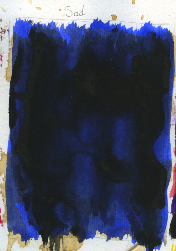
The next emotion I moved onto was "Sad", this was also really easy to convey as blue is usually associated with sadness and tears, I wanted the "Sad" to have a macabre and gothic feel to it, so I layered a very thin layer of black watercolour paint over the blue, to give it a mysterious and "deep sea" feel. I really liked the way this turned out as the black and blue work really well together, the only problem with though was that it had a similar feel to "Scary", so I thought people might get confused.
I then moved onto "Angry" this was a really fun one to do because I idea was to have a teeth or spike-like pattern underneath a layer of black paint, to give it more of a hidden anger feel to it, instead of confrontational anger, I started out by using two colours, purple and red, because this are both colours that are associated with danger and violence, and then I basically used a thin layer of black paint over the top to give it a mysterious and dark feel to it.

I had a lot of fun creating "Rough" as I was able to just go mad with the leftover textured paint, I took inspiration from metal and iron work, as this is something I would associate with hardness or roughness. I wanted the colours to be similar to "Scary". The end result was just what I wanted, a rough dark square of paint.

The next mark I moved onto was "Fast", this wasn't actually completed until after the rest of the sheet because my idea was to utilise the blank space in the square, and using toothpicks or cocktail sticks, create lines which would give the illusion of speed and movement, this was inspired by the artists I had researched for the Space Task Sheet, it didn't get completed because I didn't have any toothpicks or cocktail sticks.

The next emotion I conveyed was delicate, I always think of light pastel colours when I think of "Delicate", and also ribbons, so I painted white over the square first, and while it was still wet, drew ribbon and elegant lines using pastels, this gave it a blurry effect that enhanced the message.

The next thing I completed was "Friendly" I had a little bit of difficulty deciding what colour I would consider "Friendly" I eventually decided upon yellow and green, as these are nice bright and cheery colours, and are used a lot in children's programs because of this. I drew cute shapes like hearts and stars because these are also used in children's programs too.

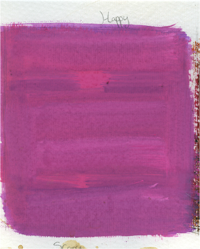
After I had completed "Friendly" I moved onto visualising the emotion "Happy" despite the many colours you can use to represent "Happy" as a mood, I had already used so many colours, and I didn't want to use the same colours, I had a bit of difficulty deciding what colour to use because of this, but ultimately I decided to go with Pink, as this was the only colour I could think of apart from the colours I had already used, such as yellow and blue. I also seem to associate this colour with happiness, as it is only really used to portray this emotion, whereas things like green and blue are used to represent Envy and Sadness, but can also be used to represent other moods, such as nature for green, and purity for blue. I created it by first using a lilac colour, and then painting over it with bright pink to give it a softer feeling.