Front cover Designs
The first objective of this task was to create a name for the mock magazine that I would be creating a cover for, I decided that I wanted my magazine to be aimed at middle-class and sophisticated women who have an interest in fashion, activism and helping the world around them. Because my font was a fur-effect font, and the double page spread was going to be about fur, I decided that this issue of the mock magazine would focus on animal rights and cruelty free faux fur fashion and clothing, the word "Corsage" popped into my head because I thought it would be an intriguing and classy name for a magazine, plus Corsage is generally made out of flowers, which could tie in with environmental activism, which could be a common factor in the magazine because it focuses on helping the world around us. I then created a front cover design by first creating some simple layout sketches, and using these sketches to develop a mock-up front cover design. Because the target audience was sophisticated women, I wanted the layouts and designs to be simple and interesting, with a sense of quality and uniqueness to them. Then I went on to find what images and fonts I would be using for the final front cover design. After this I moved on to creating a much more detailed and visual mock up, keeping in mind factors such as the placement of the masthead and cover lines, text size and colour, image colour and the overall "feel" of the magazine cover.
I thought that it'd be a good idea to have a picture of Stella McCartney on the cover as she is known for her support and activism around animal rights and cruelty free clothing and fashion. It was very difficult to find pictures of Stella McCartney herself that weren't copyrighted (there were literally none). So in the end I just had to use some images from google, so I will state now that THE IMAGES AND FONTS for the magazine cover DO NOT BELONG TO ME and have been used for PURELY EDUCATIONAL REASONS. All copyright goes to the original owners of the images and fonts used.
I thought that it'd be a good idea to have a picture of Stella McCartney on the cover as she is known for her support and activism around animal rights and cruelty free clothing and fashion. It was very difficult to find pictures of Stella McCartney herself that weren't copyrighted (there were literally none). So in the end I just had to use some images from google, so I will state now that THE IMAGES AND FONTS for the magazine cover DO NOT BELONG TO ME and have been used for PURELY EDUCATIONAL REASONS. All copyright goes to the original owners of the images and fonts used.
Cover Sketches 1& 2
These were the first two cover designs I created, there are four in total. As you can see they are very simple designs, each design includes a masthead, cover lines, a lure, a main cover image and a UPC (Universal Price Code). With the first design on the right, I wanted it to be a very simple and plain cover design, without the lure taking up too much space or being too flashy. The cover lines are positioned either side of the main cover image, with the lure in the top right corner of the page, and the UPC on the left. There are four cover lines in total on the first design.
The second design is a little more "flashy", with the lure across the front of the design, the head of the stickwoman I drew lies in front of the masthead, covering it slightly. There are three cover lines on this design, and there's no UPC. I wanted this design to be more attention grabbing and striking. The lure stretches across the whole width of the magazine, this lure would probably be in a bright colour to make it stand out even more against the background image.
Cover Sketches 3&4
I wanted these designs to be a little more artistically inclined. As you can see on the first design on the left, the masthead has been placed more towards the centre of the page, it has four coverlines on either side of the page, and a lure with a tribal inspired border, it also has a UPC in the right hand bottom corner of the design. I thought that a tribal border would be very artistic and would stand out among other magazines.
The second design on the right is quite similar to the first design on this page, however the lure is overlayed on to a striking flare shape at the bottom left hand corner of the design. This design also has a masthead, four cover lines and a UPC in the right hand corner of the page. As you can see, most of these designs are very simple and organised, just as I wanted them to be. I prefer simple designs because the are easier to organise and edit, and because a simpler magazine layout is usually a lot more legible, and would actually stand out more as it would contrast with the "busy" and messy front covers that we see today.
Image Choices
The first effort I made towards creating some digital mock-ups (which would lead me to create my final design) was to find the images of Stella McCartney that I would be using for the main cover image, I found three images on google that I thought were of a high quality (because I would've had to scale them to fit an A4 piece of paper anyway) and that I thought would work well with the overall sophisticated "feel" of the magazine. Because of this I was more drawn to black and white photos instead of colour, because black and white photos are simple, yet sophisticated and intriguing. Here are the images I chose below:

Image 1:
This was the first image that caught my eye while scrolling through googles images, it's not of a very good quality as you can see, but it's perfect in that there is already a mode of address here, because the subject is looking directly at the viewer in a confident and alluring manner.
This was the first image that caught my eye while scrolling through googles images, it's not of a very good quality as you can see, but it's perfect in that there is already a mode of address here, because the subject is looking directly at the viewer in a confident and alluring manner.

Image 2:
This image also already has a mode of address because the subject is looking right at the viewer, I chose this picture because I felt like it's classy, elegant and confident, and would really relate well to my magazines target audience. But as you can see, the image has quite a grain to it, either by design or by photo editing.
This image also already has a mode of address because the subject is looking right at the viewer, I chose this picture because I felt like it's classy, elegant and confident, and would really relate well to my magazines target audience. But as you can see, the image has quite a grain to it, either by design or by photo editing.

Now this image definitely has a much more sophisticated feel to it. Although it doesn't have a direct mode of address to it, the gaze of the subject is soft, confident and intriguing. This is also the higher quality image out of the two, I found that I was drawn more to this than any of the other photos, because even though it's in black and white, it is quite light and not too heavy on contrast. This makes it stand out, but for the right reasons. It is also easy to look at, and this would make viewers interested in it because it is easy on the eyes.
In the end I chose the first image, and the last image, because one has a good mode of address, and is in colour, and the other is very high quality, fit the sophisticated "feel" I wanted and is easy on the eyes.
In the end I chose the first image, and the last image, because one has a good mode of address, and is in colour, and the other is very high quality, fit the sophisticated "feel" I wanted and is easy on the eyes.
Digital Mockups
The second effort I made was downloading some fonts that I wanted to experiment with and try using for the mock-ups and eventually the final front cover design. I downloaded four fonts, each with their own distinct style and "feel", from a website called Dafont.com. I was very drawn towards more natural, plant-like and elegant fonts because these are all things I'd associate with the word Corsage.
Here are the fonts below:
Here are the fonts below:


I chose this font because it has a very "flowery" feel to it, and because it's very bold. It's a lovely font that could be very eye-catching, and very feminine if used with the right kind of magazine cover.

Again, a very flowery font, but this font is much more sophisticated and elegant, it's almost more of a gothic inspired font though.

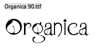

This font is very organic and wholesome, it's the sort of font that you'd find as a logo for a vegeterian, or vegan restaurant or wholefoods specialist. It also has quite a gothic feel to it, despite being an "organic" font, this could be because it's in black though.


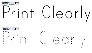
This is a very elegant font in my opinion, it's interesting and feminine, and gives off a very classy feel. It's also quite legible despite being a novelty font.
MASTHEAD Experimentation
Before creating my final front cover design I firstly had to play around and experiment with the fonts and cover images, creating mastheads and coverlines, to find what worked together well and what didn't (what contrasted well or clashed horribly). I first concentrated on what the masthead would look like and what font it would be in because this was the first thing I was going to add. I then moved onto creating coverlines and experimenting with the font, size and placement of those. After this I created my final cover design, which I consulted with my tutor and another tutor on, to get more opinions on how it looked and what they thought looked best.
The first image I experimented with was the colour image of Stella McCartney, I chose this one first because I thought that a colour image would be more difficult and tricky to work with than a black and white image. (View the images to see the description).
The first image I experimented with was the colour image of Stella McCartney, I chose this one first because I thought that a colour image would be more difficult and tricky to work with than a black and white image. (View the images to see the description).


After I had completed these experiments, I realised that this image was difficult to work with, and that I couldn't get the result I wanted from it, I didn't think any of the colours or fonts really got my attention, they were too bland and didn't give of the professional feel I wanted.
After coming to this conclusion I decided to have a play around with the black and white image of Stella McCartney, as this was the image that really caught my attention and I felt I could achieve to "look" I wanted for my magazine cover.
After coming to this conclusion I decided to have a play around with the black and white image of Stella McCartney, as this was the image that really caught my attention and I felt I could achieve to "look" I wanted for my magazine cover.


Coverline Experments
Now that I had found the masthead I was going to use, I then had to move onto finding the cover line fonts I wanted to use and play around with the mock up cover. Here are the fonts I chose on Dafont.com below:


And here are the mock ups I did.
As you will see, I started off with very basic coverlines that then became more complex and interesting. I have played around with the layout and have consulted with my tutors on what they thought was best to create the final front cover design shown below the gallery. There is annotation on the two last images and the middle image on the fifth row (just so you don't have to click on ALL the images to get the info you need).


Final Cover Design
This is my final front cover design, I personally think that it looks very professional and well-executed. It gives off a classy and elegant feel, without seeming elitist or snobbish, it's very alluring and inviting, as if you are casually sitting next to a friend in a coffee shop or cafe'. It very soft, but would also stand out against the crowded and tacky covers of today.

It is simple, down to earth and to-the-point, without being bland or boring, I personally would pick up this magazine because I personally would be drawn to the design. The fact that it's in black and white would also make it stand out on a magazine rack, as you don't usually see monochromatic covers, as covers are usually vibrant and eye-catching, not to mention bold. I feel that having the UPC on the cover was a good choice as I personally think it makes the cover look more professional and "real".
Looking back at the sketches I made, I really have strayed greatly from the sketches I drew. I have kept the obvious things such as a masthead and coverlines, but I have done away with the concept of a lure, because sometimes these make the magazine look busy and even tacky. However, I have kept in mind the feeling of simplicity, as that's something I was thinking about with my original sketches. So I guess in the end, I actually used less cover elements than my original sketches. The other thing that differs is that the photo is a close-up of Stella McCartney, whereas the stick figures on my sketches are almost full-body figures.
I think that my choice of image also proves that sometimes a direct mode of address isn't always necessary to give a magazine impact or softness.
I am personally very happy with this design and think it turned out very well, I like the colours, the layout and the image and although I feel that the white cover-line should've been placed higher on the cover, placing it lower hasn't negatively affected the legibility so I'm quite fine with it. The most important thing to me with this task was to make the design look professional, and I feel I have achieved this.
